SEEN | Michael Snow’s »Goddess of Space« (+ Toronto’s Aeroquay One)


At the top of the escalator in Toronto Pearson’s T1 Pier D, Gates 101-112, welcoming small planeloads of Northlanders to the big city from locales with exotic sounding names such as Sault Ste. Marie, North Bay, and Thunder Bay, is a Michael Snow painting from ca. 1962 entitled Goddess of Space – Rockette.
This piece, which most passengers probably don’t even notice (the day I passed through maintenance had decided to dump its mini-crane right in front of it) …

… was originally commissioned for Toronto’s then avant-garde Aeroquay One, demolished in 2004.
It’s a significant piece of mid-century Canadian art and it gives me a smile every time I fly to Kingston. After all, take a look at this Goddess’s figure — she seems so earthbound with her enormous legs and tiny head (or else she’s presaging the Elephant Pant trend a decade later). Très ironique:

I love Michael Snow. He’s a Canadian legend who helped define what modern meant when modern meant something.
The Greater Toronto Airport Authority (GTAA) made a wise move when it saved this piece for Moshe Safdie’s new, improved, T1. Too bad, though, that Rockette didn’t get a better wall to hang on.
°
°
°
What follows is a hagiographic history about her former home, the amazing Aeroquay …


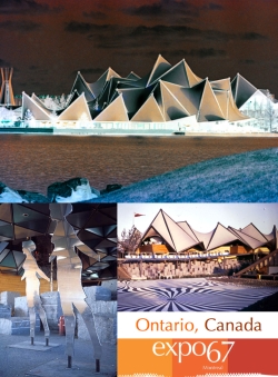
Something happened to the arts in Canada between 1964, when Aeroquay One opened, and 1967, when expo 67 showed the world how sophisticated Canadians had become.
There was a veritable explosion in the creativity level in the country as it geared up to welcome the world to a Canadian vision of future at expo 67.
Michael Snow was part of both events. His Goddess of Flight – Rockette was installed at A1 in ’64 and millions walked past (or minirailed near) his Walking Women at Macy DuBois’s beautiful Ontario pavilion at Canada’s showcase to the world:


One summer, I worked at Transport Canada’s library in Aeroquay One’s admin building (above), and used to take my lunches in the ‘quay, so I got to know the old terminal pretty well.
Aeroquay. What a romantic and modern (even futuristic) sounding name. Ultramodern. It harkens back to the day when flying implied money and, therefore, elegance.

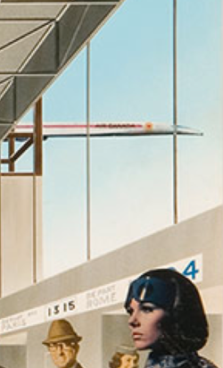
1964 | Air Canada/Trans-Canada Air Lines advertisement – »Quand un mari voyage« (When a Husband Travels)???
SOURCE > TCDR (check it out!)


When it was built, Parkin Associates’ Aeroquay was in the vanguard of transportation design.

Planned as the first of three aeroquays, with the other two to follow as Toronto’s population grew, it was the world’s first circular airport.

The entry to this donut with a square 9-storey, 2,400-car parkade [n. (Canadian) a building used as a car park] above it was via an under-the-tarmac tunnel:

One emerged from the relative darkness of the tunnel to the brightly lit Departures level, with its straightforward, cool minimalist interior of white terrazzo, white Formica, and stainless steel with black granite accents:

PHOTO > Chris Lund
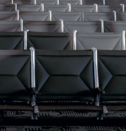
The aeroquay’s seating was Canada’s answer to the Eames’ Tandem Sling Seat (related posts, below), perhaps the most ubiquitous, and in my opinion the most beautiful, public seating invented.
Robin Bush’s »Component Public Seating Group Lollipop« design owes a lot to George Nelson, but makes perfect sense for Parkin’s circle-surrounding-a-square motif for the aeroquay’s design. More than 1,200 of the units were made during the initial run for the new terminal and the design was eventually used throughout the building for more than 30 years.


Bush’s furniture was one of the gems of the aeroquay’s tiny waiting rooms (the double-row plane was still off on some horizon).
The aeroquay’s 24 gates were contained in the 183-metre-long concourse ring.
A swank restaurant, “The Aeroquay,” was on the mezzanine level atop a wedge of the circle (photo, below) overlooking the airfield.

The total cost for this marvel of modernism was a cool $27.5 million bucks in ’64 dollars.
Aeroquay One must have appeared ultramodern when Canada’s 14th PM (and Nobel Peace Prize winner) officially opened its doors on 28 February 1964 (look at that Mountie and the international assortment of stewardesses):


Alas, the thinkers at Parkin Associates didn’t plan for the arrival of 747s disgorging hundreds of passengers at a time. Or hijackers and the need for something called security.

Plans for Aeroquay Two and Aeroquay Three were abandoned and, over the years, Toronto’s airport declined into a semi-nightmare of Heathrow proportions. Something had to be done.

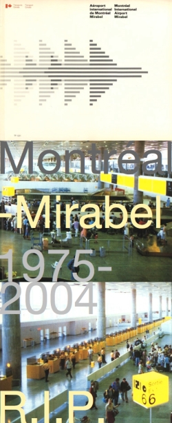
In the late sixties the feds, thinking along Mirabel (Montréal’s doomed aviation disaster from the ’70s) lines, started purchasing thousands of hectares of land (7,430 to be exact), to the east of the city in then-rural Pickering, hoping to ditch the Mississauga airport location altogether.
Lots of farms were appropriated in 1972 but before things “got off the ground” the citizens of Toronto got their act together and protested until Ottawa caved.
Now, four decades later, plans for Pickering II are underway (see links). The battle begins again.
°
°
°
Meanwhile, back in the Jet Age, Chicago’s linear-style plan won over the thinking of most airport architects …

1963 | Hedrich Blessing
… with the notable exception of Paul Andreu (of Beijing’s National Centre for the Performing Arts fame) …

… whose radical ’70s design for Paris’s Aéroport Charles de Gaulle T1 took the donut concept to extremes (no windows to look out at the pretty planes on the tarmac, for example), but whose futuristic vision was the inspiration for a classic piece of ’70s album art:


BELOW > Alan Parsons Project, I Robot, 1977

°
°
°
With the failure of Pickering I, Toronto’s airport required a new master plan, and Moshe Safdie (along with Skidmore, Owings and Merrill) was chosen as architect for a new terminal (T1). New millennium; new concept.
I think this commission marked Safdie’s return to form as he made a decisive move away from the post-modernism that marked a lot of his post-Habitat work (e.g. Vancouver Public Library).
Toronto Pearson’s Terminal 1 is a fine piece of airport architecture that rivals its Aeroquay predecessor. Its clean, straightforward lines meet with my approval whenever I fly through T.O. Vancouver’s airport, on the other hand, is a mishmash that looks like the lowest bid always won during successive and never-ending additions.
°
°
°
I overheard two Air Canada flight attendants discussing Safdie’s terminal when it finally semi-opened in April 2004. They hated it. Too antiseptic was their verdict. “Too white.” Vancouver, in their view, was fantastic, “like a mall with Native sculptures.” Exactly.
I’ll give Safdie his props. Just give Snow’s Rockette a more prominent location within T1 and add a beautifully curated history of the old Aeroquay somewhere within the terminal’s confines and I’d be a very happy camper.
Funny, though, when I look at the structure from the air, I can imagine the new terminal expanding in ovoid fashion around Safdie’s very beautifully detailed parkade, forming, over the years, a new Aeroquay with the cars back in the middle of it all, just where they belonged during the Jet Age.


")


2 PHOTOS ABOVE > wyliepoon


-1")


![]()

")
 and on November 4th, the final chunk of Aeroquay One disappeared into history.")


★ Toronto Modern | Postcard: Aeroquay One, Toronto International Airport
★ Toronto Modern | John B. Parkin
torontoist | Torontoist Remembers: Aeroquay One
Canadian Architect | Terminal Optimism: A critical look at Lester B. Pearson’s new Terminal One in reference to its past, future and the building type that it represents
Google Books | Made in Canada > When “la Dolce Vita” met “True Canadianism” Canadian Airports in the Sixties
Rhodri Windsor-Liscombe | Grounding the New Perspectives of Modernism: Canadian Airports and the Reconfiguration of the Cultural and Political Territory PDF
Inco Triangle, July 1962 | Toronto’s Airport a Modern Poem in Nickel Stainless PDF
GTAA | The Visual and the Visionary: Art, Architecture and the Airport PDF
GTAA | Celebrating Success: 10th Year Anniversary 1996-2006 PDF
GTAA | Old Terminal One Decommissioning and Demolition PDF
GTAA | Community Relations: Pickering Project
designKULTUR | ARCHITECTURE + TRANSPORTATION | Ottawa Union Station :: John B. Parkin Associates, Architects, 1966


About this entry
You’re currently reading “SEEN | Michael Snow’s »Goddess of Space« (+ Toronto’s Aeroquay One),” an entry on designKULTUR
- Published:
- 2011/01/27 / 14:57
- Category:
- AIRLINES + AIRPORTS, ARCHITECTS + ARCHITECTURE, ART + ARTISTS, CANADIAN DESIGN, CITIES | TORONTO, EXPO 67 | MAN AND HIS WORLD, PUBLIC ART, TRANSPORTATION | PUBLIC, TRAVEL
- Tags:
- Aéroport Charles de Gaulle, Aeroquay One, Air Canada/Trans-Canada Air Lines, Alan Parsons Project, »Component Public Seating Group Lollipop«, »Goddess of Space«, Canada, Chicago O'Hare, Eames Tandem Sling Seat, expo 67, Greater Toronto Airport Authority, Greater Toronto Airport Authority (GTAA), I Robot, Lester B. Pearson, Macy DuBois, Michael Snow, mid-century Canadian art, Mirabel Airport, Montréal-Mirabel, Moshe Safdie, Nobel Peace Prize, Ontario pavilion expo 67, Paul Andreu, Pickering Airport, Pickering Airport II, PUBLIC ART, Robin Bush, The Aeroquay Resstaurant, Toronto, Toronto Pearson International Airport, Transport Canada, Vancouver Public Library


2 Comments
Jump to comment form | comment rss [?] | trackback uri [?]